
Since so many people have emailed me wanting to know what is what with the new interface I've decided to do another tutorial, but it has taken me hours and hours to just do some investigating, problem solving, testing(!) and this will be short. I can do a bit more in depth given time, but time is a luxury to me at the moment so let's do quick and easy and see where this gets you. First of all, this is how I do it. (Now, remember, I'm on a Mac so the photos of my desktop will look a bit strange to those of you on a Windows PC, but a browser is a browser and they all look the same and work pretty much the same on all computers. I've also kept my images at 800 px wide proportionately and that's as big as I'd like to go because any bigger and those of you on smaller screens would have to scroll. I have a very big screen on my iMac.
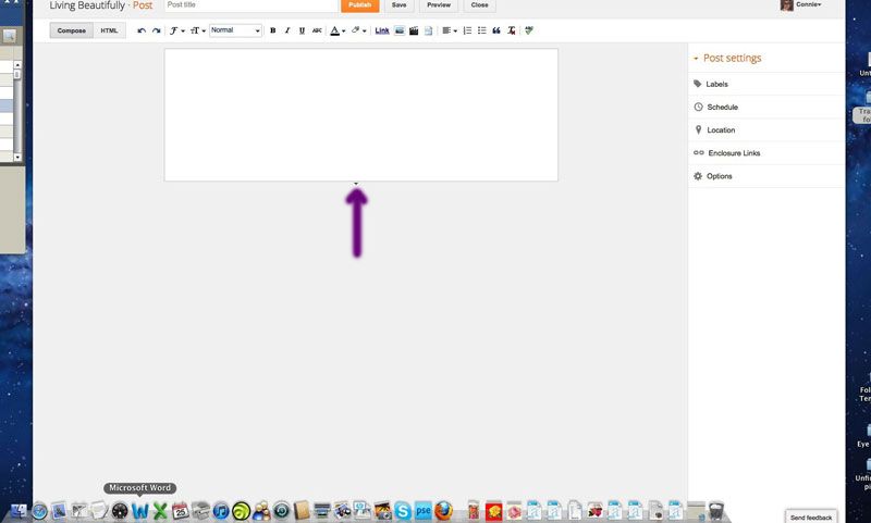
But first a big word of caution. On the old interface your buttons to publish and preview were far apart. One at the top of the window and the other at the bottom of the window. As you can see here they are almost beside each other. The Publish button, however, is orange so there shouldn't be much of a problem; however, I can't tell you how many times I've gone to that orange button and almost Published instead of Previewed. So just be cautious when you're wanting to Preview it before Publishing. When it's published, it's published! Done deal. You can edit it but I schedule mine for months at a time so if I inadvertently hit Publish before I want to and have forgotten to schedule the time, it's done. That's one reason I put a date a month ahead in the Schedule box before I do anything! I don't want it to show before I'm ready for it to show.
But first a big word of caution. On the old interface your buttons to publish and preview were far apart. One at the top of the window and the other at the bottom of the window. As you can see here they are almost beside each other. The Publish button, however, is orange so there shouldn't be much of a problem; however, I can't tell you how many times I've gone to that orange button and almost Published instead of Previewed. So just be cautious when you're wanting to Preview it before Publishing. When it's published, it's published! Done deal. You can edit it but I schedule mine for months at a time so if I inadvertently hit Publish before I want to and have forgotten to schedule the time, it's done. That's one reason I put a date a month ahead in the Schedule box before I do anything! I don't want it to show before I'm ready for it to show.
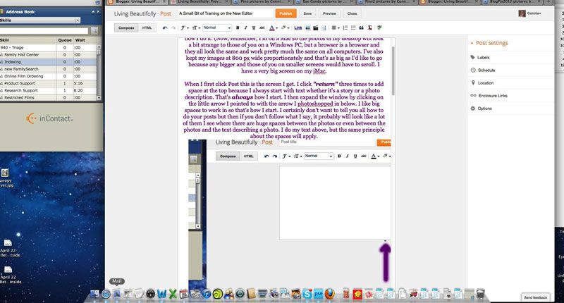
When I first click Post this is the screen I get. I click return three times to add space at the top because I always start with text whether it's a story or a photo description. That's always how I start. I then expand the window by clicking on the little arrow I pointed to with the arrow I photoshopped in below. I like big spaces to work in so that's how I start. I certainly don't want to tell you all how to do your posts but then if you don't follow what I say, it probably will look like a lot of them I see where there are huge spaces between the photos or even between the photos and the text describing a photo. I do my text above, but the same principle about the spaces will apply if you want your text/descriptions below

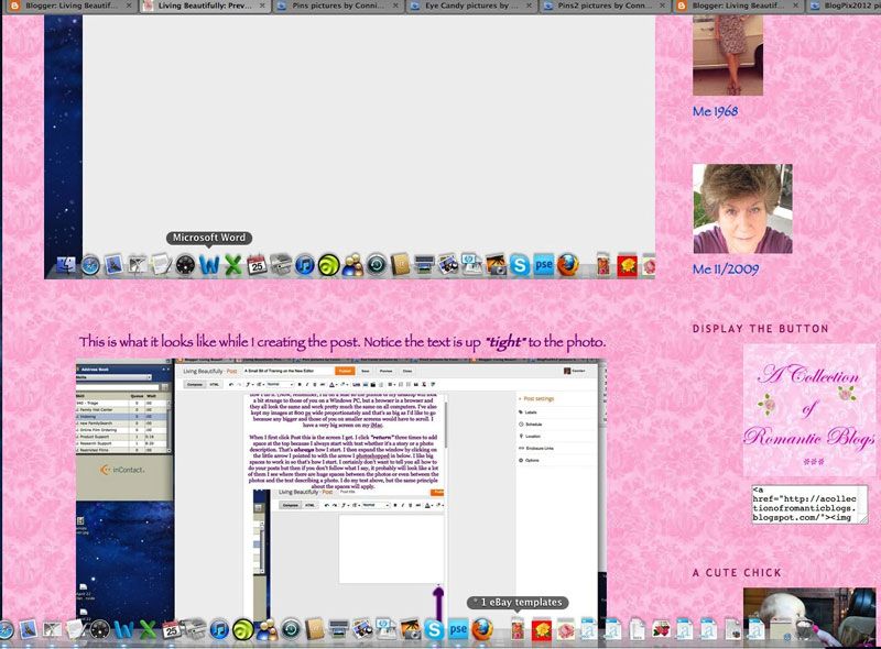
This is what it looks like while I am creating the post. Notice the text is up tight to the photo.
Well, this is how it looks when I Preview it and will look like when I publish it. And I've not added any breaks/returns at all. (Truly, this is in the way that the new interface HTML is written so there is nothing to do but accept the way it looks. I doubt seriously if this is an issue coders would consider important, but they aren't OCD women!)
There aren't many of us happy with the new editor, me included, but it is what it is and there's probably nothing we can do about it. We just may as well get used to it because it's here to stay. But we can get it to do what we want it to with just a simple lesson today explaining what things are on the new interface. I'll probably end up loving it in the end but this will be only after I figure out how to make it stable for me and do what I want it to. I've even worked with their html but on the first try it limited my photos to 400px wide by 344px long. That is not acceptable to me. I like large photos to show on my blog. I do not like those tiny ones some people put on.
Anyway, I think that's enough to get you started. There will be more, lots more, later. I'm just tired at the moment with trying to solve some immediate problems for people who can't get on the blogs at all. But I promise I'll do a more in-depth tutorial soon. Just be cautious. I can probably do an in depth tutorial later, but I want to see how I can work with the HTML template first. If anyone has any question, I'd be happy to help. You can send people who are asking about the new interface over here if you'd like. I truly am happy to help anyone I can. I know this is frustrating but change is inevitable with technology. We're all a technology-loving family. :-)
*
Now, I'll never leave you without some beautiful photos to peruse so see what follows.
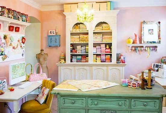
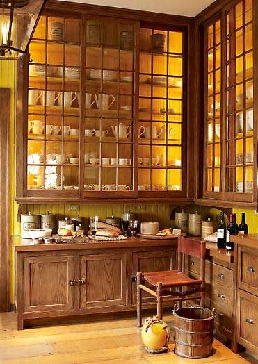
This is one of the most stunning places I've ever seen for a craft room and storage of fabric. Notice this chick has a Mac computer. ;-) Smart girl.
This is one of the most stunning places I've ever seen for a craft room and storage of fabric. Notice this chick has a Mac computer. ;-) Smart girl.
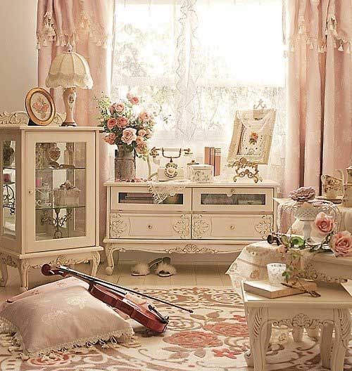
Just soothing for the soul to see.
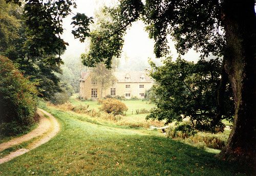
Come take a walk down a country lane.
Gasp!!!
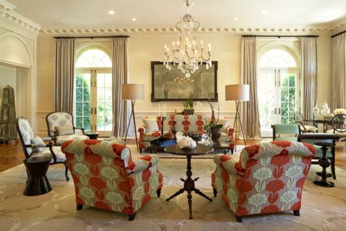
While not fond of orange, I still love this room setting and the comfortable-looking seating.
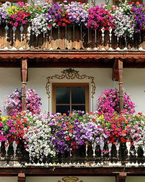
Beautiful gardens on second and third story building.
Somewhere in Europe judging from the sign on the building. Perhaps I've never mentioned this but when we visited Ireland their street signs were on the buildings, but a street name could change within a blog or two while on the same street. Very confusing.

The other day while getting ready to go out for dinner I asked Love Bunny (Has anyone ever noticed how Love Bunny—what I call him on here to preserve his privacy—has the same initials at Living Beautifully?) how my hair looked as I badly needed a cut. He said, "It looks a bit fluffy."
I said, "It's been fluffy for 51 years." Duh! Funny man.
~*~


